Your Cart Is Empty
✖No products in the cart.
April 5, 2025
Web Design
Information Technology
www.hyperelevating.co.uk
HE was founded in response to a recurring challenge faced by startups and small businesses: the absence of a structured, professional system to guide and support growth. Many entrepreneurs struggle with disconnected tools, inconsistent advice, and a lack of execution.
HE’s brand identity is a direct answer to this gap—it represents clarity over complexity, execution over theory, and impact over noise. The brand is grounded in the belief that professional infrastructure shouldn’t be exclusive to large enterprises. HE exists to make operational excellence accessible, fast, and transformative.
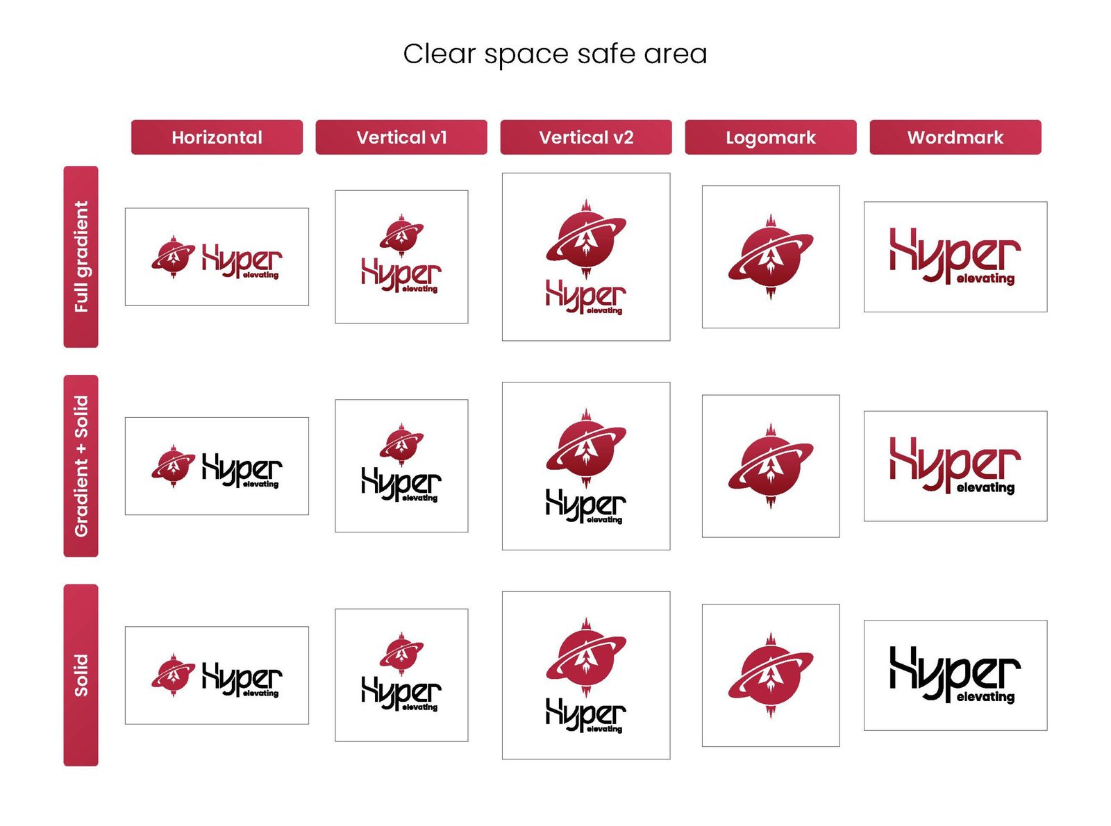
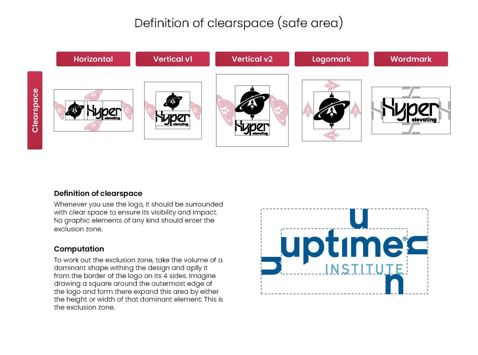
The ideation behind Hyper Elevating (HE) was driven by the belief that every business deserves a launchpad. Too many founders get stuck building the runway instead of taking off. HE was created to change that—offering a results-oriented system that unites business strategy, digital tools, and structured execution. Visually, this concept of elevation is embedded in the brand’s most iconic symbol: the rocket orbiting a planet.
The rocket represents velocity, ambition, and engineered lift-off, while the planet signifies stability, gravity, and the grounded systems that make sustained growth possible.
Together, they embody HE’s mission: to provide the tools, team, and trajectory for businesses ready to rise. The brand doesn’t just look upward—it moves upward, turning ideas into momentum and momentum into measurable progress.
